Sections reference
Add sections in the theme editor with Add section. Every section has its own color scheme, padding, and (where relevant) layout settings. This page groups them by job and walks through the signature ones in detail.
Layout
- Header: logo, navigation, search, account, cart. Styles: utility, editorial, commerce. Supports mega menu panels, a free shipping bar, and the cart drawer.
- Footer: menu, support links, newsletter signup, social, region and payment icons. Styles: system, compact, editorial, split.
- Announcement bar: rotating messages with optional country and language selectors.
- Breadcrumb: configurable breadcrumb trail for inner pages.
Homepage and campaign
- Hero: full-bleed image with headline, buttons, and optional visual effect.
- Slideshow: multi-slide hero with per-slide content.
- Lookbook: editorial image grid with shoppable hotspots (detailed below).
- Drop system: product drop with live countdown (detailed below).
- Build your kit: multi-slot bundle builder (detailed below).
- Route map: day-in-the-life timeline with imagery and featured products (detailed below).
- Statement: full-width banner with quote, background image, and button; repeatable banner blocks.
- Marquee: scrolling text ribbon.
- Promo grid: mixed grid of promotional tiles.
- Welcome: intro band for landing pages.
- Featured collection: product grid or carousel from any collection.
- Featured product: single product spotlight with a working buy form.
- Collection list: collection tiles with captions.
- Compare slider: before-and-after image comparison.
- Image gallery: uniform or full-bleed image grids.
- Image with text: split media and copy band.
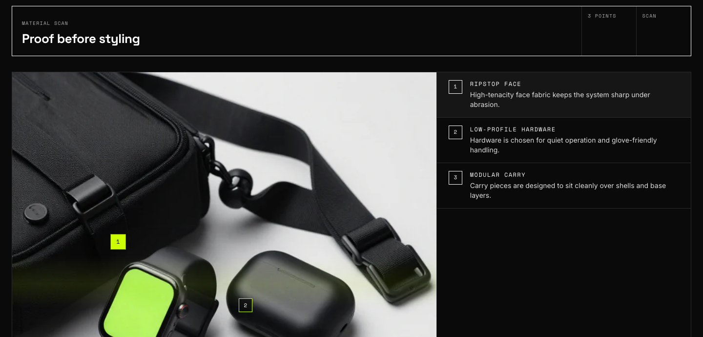
- Material scan: macro image with positioned annotation points.
- Field assurance: trust and guarantee band.
- Collection story: numbered chapter timeline.
- Testimonials: customer quotes.
- Logo list: press or partner logos.
- Blog posts: recent articles feed.
- Video: hosted or embedded video with cover image.
- Map: store location with stockist details.
- Rich text: headline and prose band.
- Multicolumn: icon or text columns.
- Collapsible content: accordion rows.
- Newsletter: email signup band.
- Contact form: name, email, phone, message form.
- Custom Liquid: raw Liquid slot for app embeds or custom markup.
Product page
The Product section renders vendor, title, rating, price, and description as reorderable blocks, plus collapsible rows, app blocks, and a Custom Liquid block. Companion sections:
- Field spec: spec-sheet grid from product metafields with size guide.
- Product loadout: companion products from the
loadoutmetafield. - Product use modes: scenario tabs for one product.
- Product motion spec: animated spec callouts.
- Product field note: editorial aside.
- Product FAQ: per-product questions.
- Product apps / reviews: host block for review apps (Judge.me, Loox, Okendo). The star rating on the product page reads the app's rating metafield.
- Related products: automatic recommendations, loaded on scroll.
- Complementary products: "pairs with" products from Search and Discovery.
- Recently viewed: browsing history row.
- Quick view: the modal opened from card quick-view buttons.
Signature sections
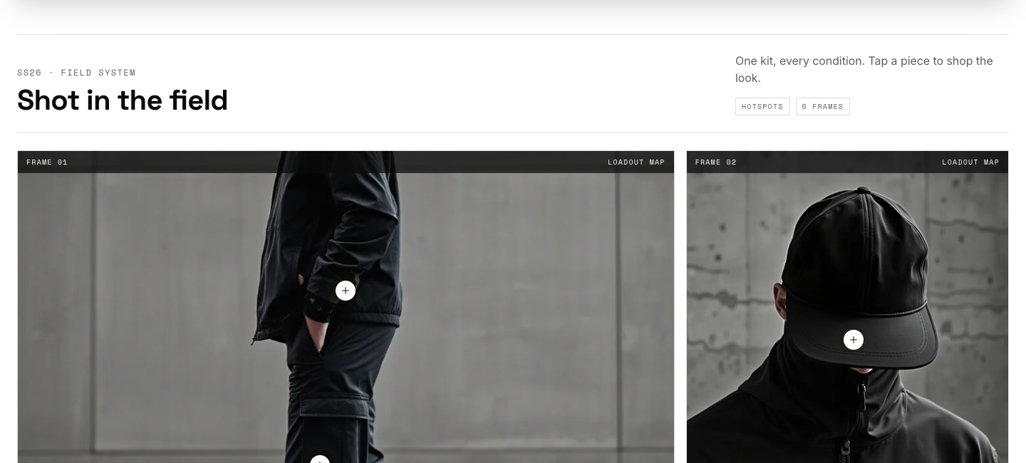
Lookbook
Add Shot blocks (image, caption, optional focal point) and up to two hotspots per shot. Each hotspot takes a product plus horizontal and vertical position sliders; customers tap the marker to open a product tooltip with price and a quick-view link. Editorial note blocks drop pull-quotes between shots. Three layout modes: editorial (mixed spans), grid, and single column.
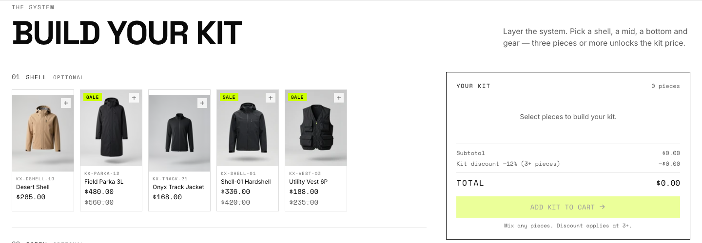
Build your kit
Add one Slot block per kit position (Shell, Layer, Bottom, Footwear, Carry, Gear). Each slot sources products three ways, in priority order: hand-picked products, a collection, or a comma-separated list of product types. Set the bundle discount percentage and minimum pieces on the section; the summary card updates live as customers add pieces, and the whole kit goes to the cart in one action. Pair the display discount with a real automatic discount in your admin.
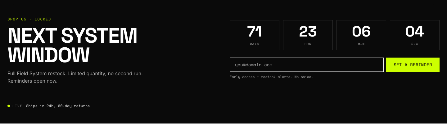
Drop system
Set a target date and time; the countdown runs live and the section flips its state when the date passes. Blocks cover the drop product list, a signup form for notifications, and stat callouts.
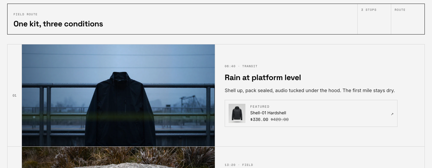
Route map
Add Stop blocks: a time and place label, heading, caption, an image, and an optional featured product with live pricing. Two layouts (board and timeline) and two visual styles (signal, with volt viewfinder framing, or quiet). Stops without an image show a route diagram placeholder, so the section never looks broken while you gather photography.
Material scan
Upload a macro fabric or hardware image, then add scan-point blocks positioned by percentage coordinates. Each point carries a label and detail line rendered in the theme's instrument style.
Mega menu
Configured on the Header section rather than as its own section. One panel block per top-level menu item; see the setup guide.
Templates
Every template is sectioned, so you can add any section above to product, collection, page, blog, cart, and search templates. Waypoint ships alternate demo templates (editorial and campaign product layouts, carbon and sand collection styles) you can assign per product or collection, plus a contact page template with the form wired in.